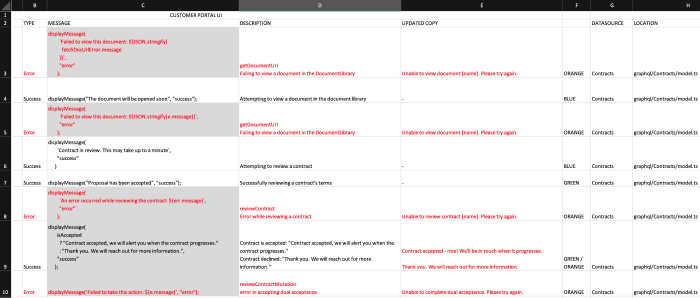
As the only UI UX Designer and UX Writer at PowerFinance, I took charge of all user-facing microcopy on the platform. At this stage, we had roughly 200 notifications, prompts and other pieces of copy that needed rewriting as they were previously written by a variety of other team members on an ad hoc basis.

A collection of all messages on the platform
To begin, I collaborated with the Engineering team to conduct a comprehensive audit of the entire platform to identify all instances of microcopy. After compiling them into a central document, I observed several inconsistencies where different words were used to convey the same meaning, such as members/users/contact persons or log in/sign in. Additionally, I noticed variations in the use of sentence case and title case.
I then developed a preliminary UX writing style guide encompassing brand character, content principles, tone and voice, grammar and punctuation, and usability. I shared this guide with Product, Engineering, and Marketing and incorporated their feedback.
Using this style guide, I rewrote over 200 pieces of copy to align with these new guidelines and reviewed them with a select group of team members. Once finalised, I shared the updated copy with the engineering team for implementation across the platform.
Ultimately, the result of the effort was a reduction of 12 characters in the average notification length, along with consistency in punctuation and grammar. Furthermore, the appropriate messaging received an injection of brand voice, enhancing its impact and character.