PowerFinance is a fintech business that exists to make purchased electricity in New Zealand traceable. It provides consumers the ability to match their usage of electricity to the generation source, and more closely match the time of that usage to the generation of electricity used.
I was the only UI/UX designer within the business and oversaw the design of the platform end-to-end. I worked within the Product team of 5, and alongside 15 software engineers.
PowerFinance had a very rudimentary onboarding process, and this was acceptable as we were pre-user and primarily had it for testing purposes.
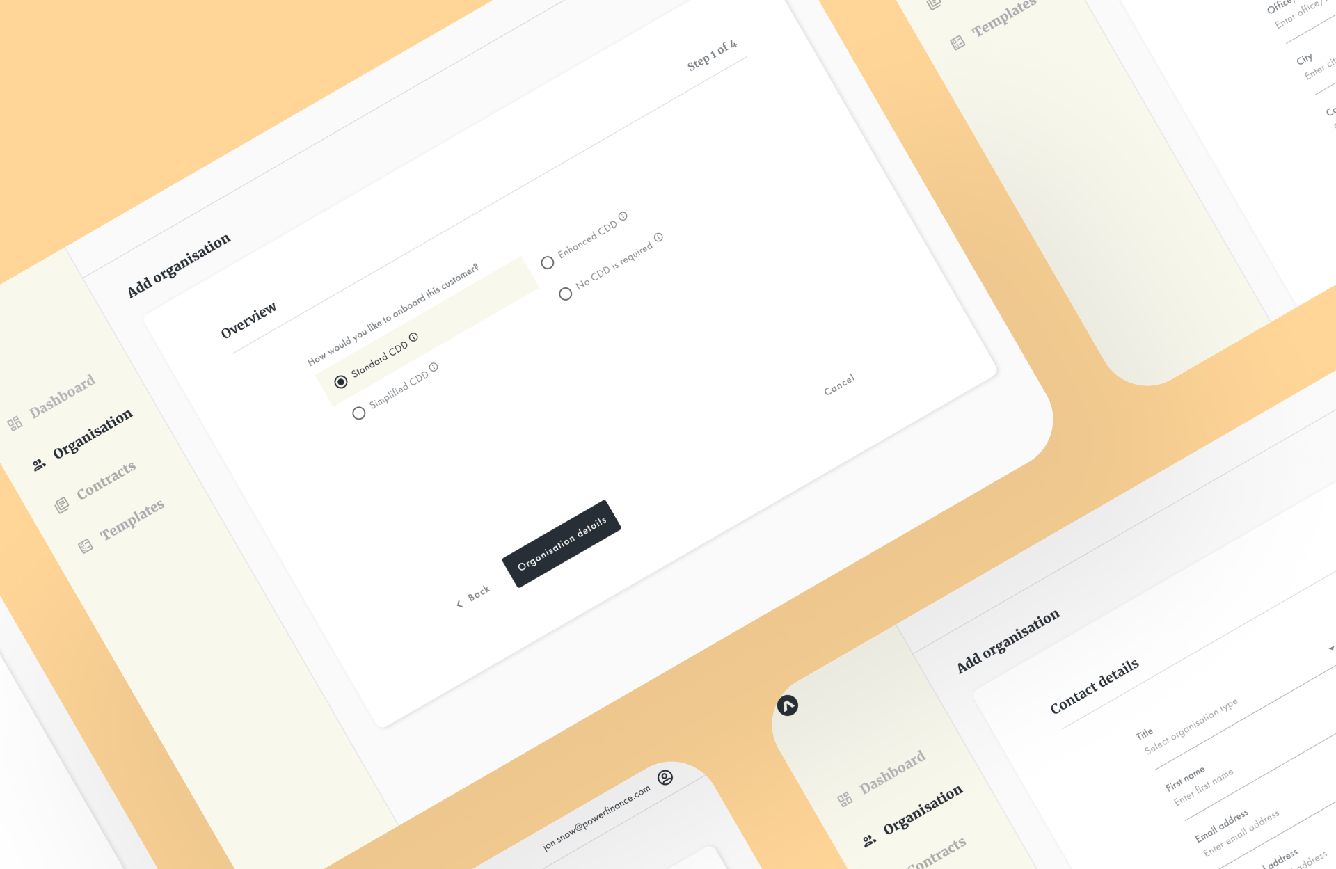
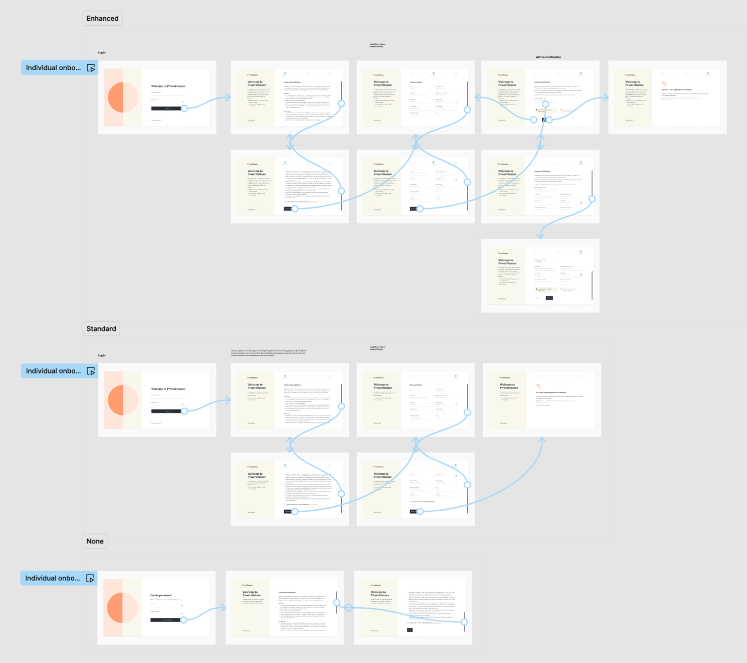
The Product team was tasked with implementing multiple onboarding flows for individuals and organisations, of which the organisations had choices of ‘None’, ‘Standard’, or ‘Enhanced’ paths. A key consideration was to decide on how to enable the organisations to select which path they would need to go down - as they might not know themselves. All individuals had only one choice which was much simpler.

Post-it note session to flesh out the different paths and requirements
To begin, I conducted research interviews with our primary users - the account managers, to identify any pain points they were experiencing with the current flow and to gather their feedback on what they would like to see in an ideal product. Since we had no real users at this stage, the research was kept internal. The research focused on understanding user goals and needs, uncovering pain points with the existing user journey, and determining task success metrics.
Based on the problems identified, I worked on addressing the pains by developing potential solutions such as reducing the number of steps to minimise completion time, surfacing mandatory fields and error validation, and establishing a clearer visual form hierarchy.
To gather feedback on the overall layout and structure of the new flow, I created low-fi wireframes and asked for input from Product, Engineering, and the users. After observing that the flow for individuals had no issues, but the flow for organisations had sticking points during the first screen where they had to choose a path, we decided to include clear definitions of each path and shrink the questions down to three from six. Additionally, an automatic recommendation based on their answers was added.
Next, high-fi designs were created and shared with the engineers. I collaborated closely with the engineering team to specify any missing interactions not covered in the high-fi mockups. Finally, a UX review was conducted for each front-end ticket that was implemented to ensure it was aligned with the designs before going live.


Soon after development was finished, we onboarded our first real users (woohoo)! In both the individual and organisation flows, completion time was reduced by over 50% to ~3 minutes. Lots of positive feedback was received at how simple and quick the process is. A client even expressed interest in wanting to purchase this onboarding system for his own business.
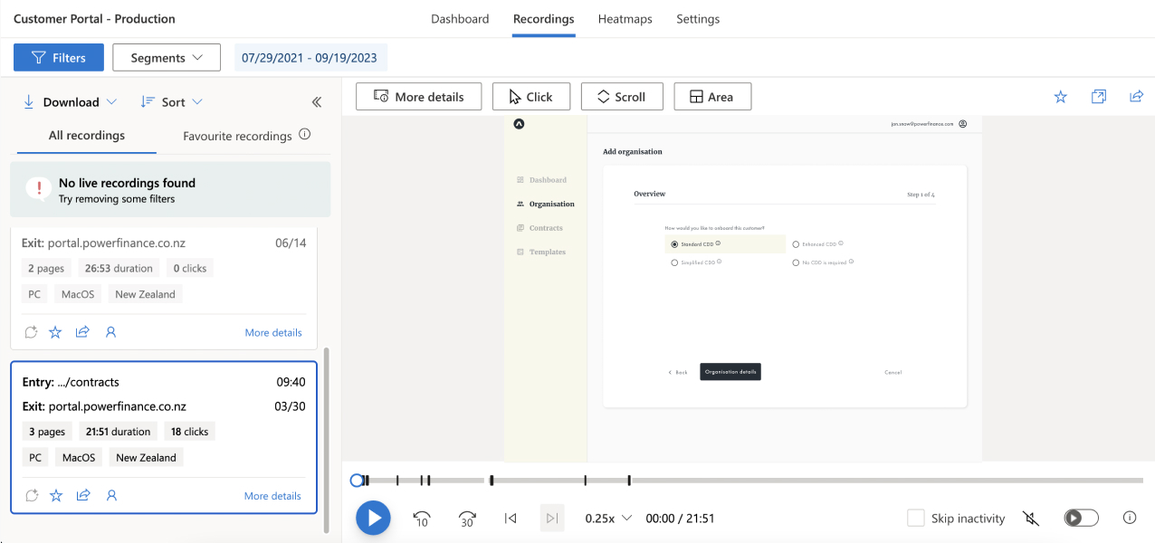
Alongside onboarding our first users, I implemented a user behaviour analytics tool that allowed for monitoring how users were interacting with the onboarding process. I spent time each week to review the recordings to see any rage clicks, or to pin point any issues that we could improve upon. This is crucial as onboarding is a core feature of the platform.