Heartland's process of designing and developing new content pages was not optimised. Each new design was being started from scratch, or at best, being copy-pasted from a previous design. This lead to major inconsistencies throughout the entire journey for every designer and developer involved.

An example page showcasing a commmonly used module - ready to drag and drop as a component.
I realised a lot of this work could be streamlined to save time and money and to reduce inconsistencies. I developed an innovative solution on behalf of Heartland by creating a Design System in Figma.
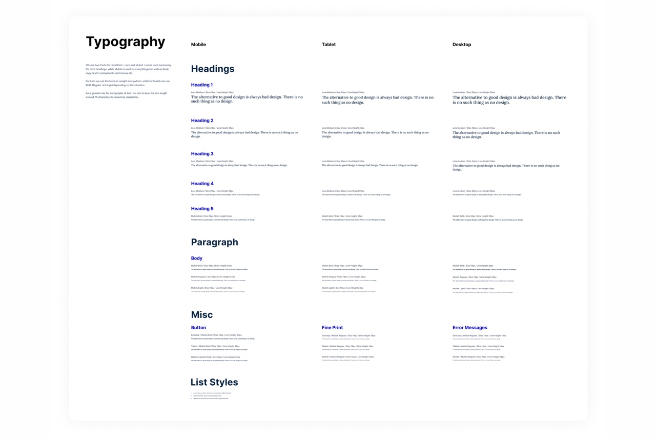
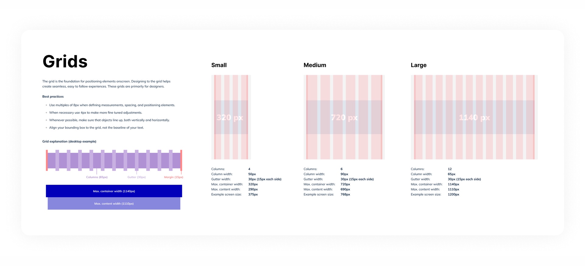
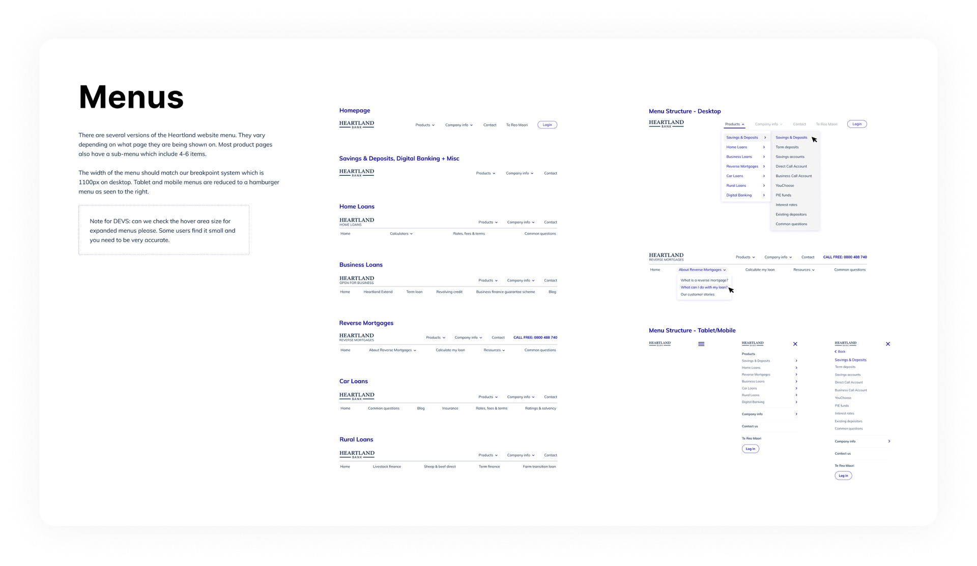
The Design System features all aspects of Heartland's web presence from typography, colours, commonly used modules, breakpoints, grid systems and form elements just to name a few.
However, the Figma part of this system was just half of it. The other major component involved working with developers to translate the designed elements into coded components using a web-based service called Storybook. This allowed them to also be able to drag and drop pre-built modules into any page.


By investing time in the Design System, I was able to save Heartland hundreds of hours of design and development time for all future website projects. This also lead to a much more consistenct website which in return helped users by creating a sense of control, familiarity, and reliability.
