Tradify was facing a significant drop off of users during the onboarding stage in their mobile app. There was a strong correlation between users finishing their onboarding and continuing as a customer, so this was a top priority.

Some minor tweaks to design
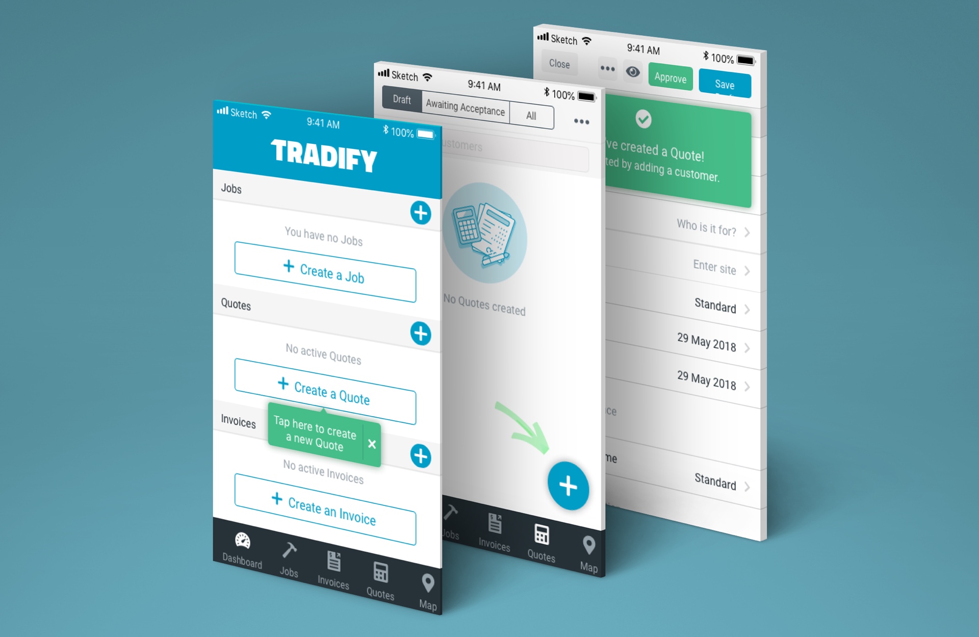
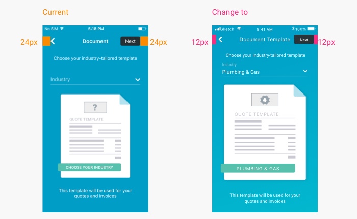
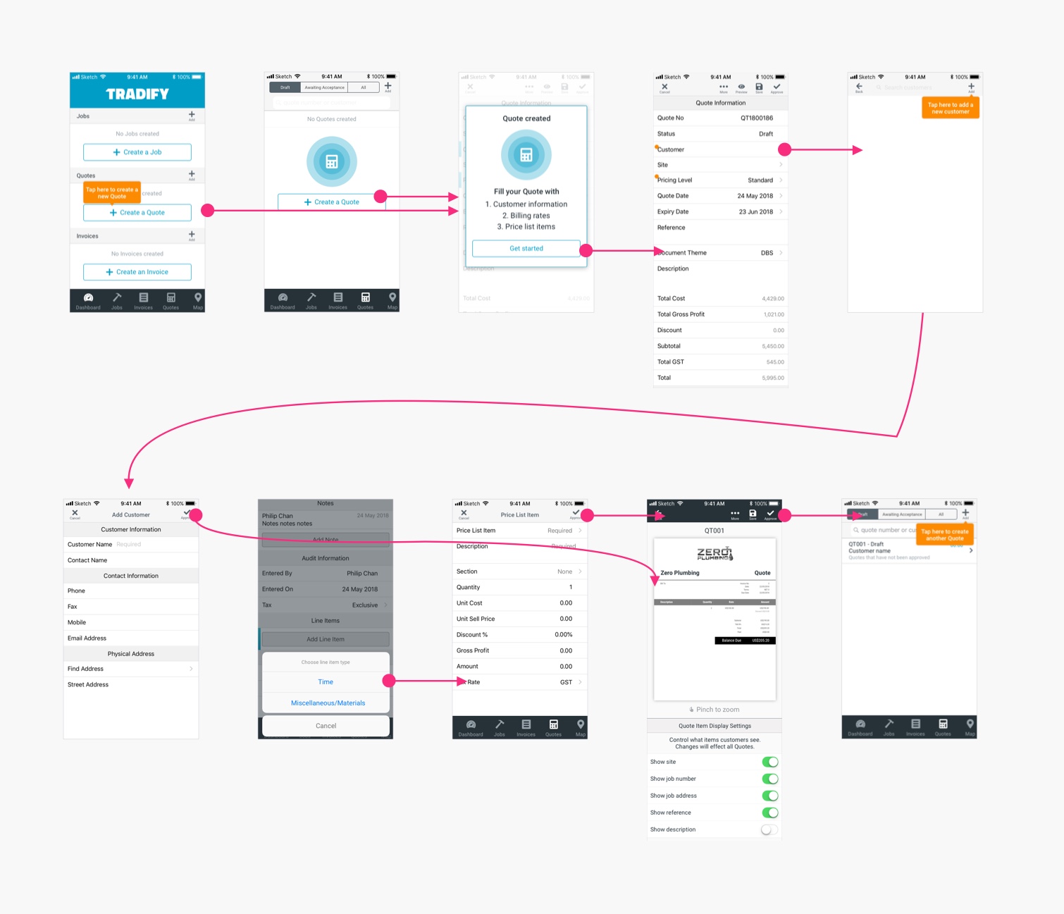
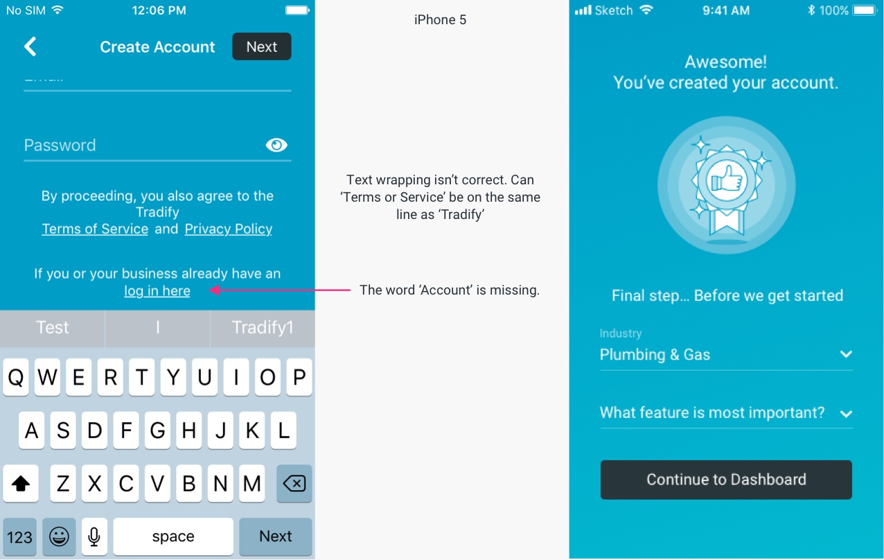
The major solution tested in this round was the inclusion of clearer and larger tooltips to guide the user along the onboarding journey. The theory was that users were getting confused and weren’t sure what to do. We used this opportunity to also update the minor design issues and inconsistencies - such as font sizes, spacing etc.


Tradify found that after rolling out these changes, there was a bump in users staying through to the end of their onboarding. Very good result!