There were several fundamental design issues with the Marketing Association's website that were hindering the objectives of the business. There was no clear indication of what the business actually does when visiting the website, the key pillars of the business weren’t easily accessible, and the organisation of their premium content and events/courses was chaotic.

The original website design
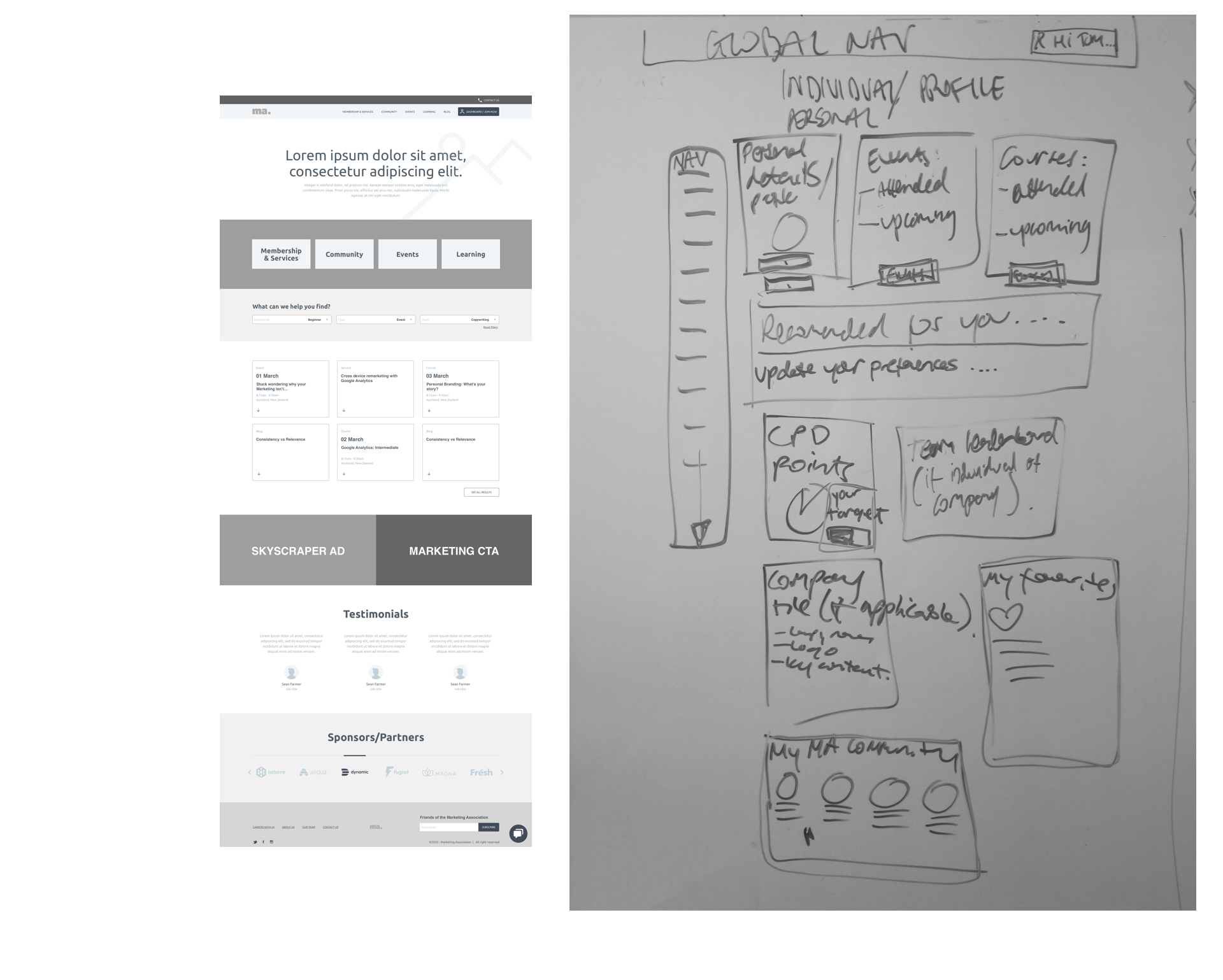
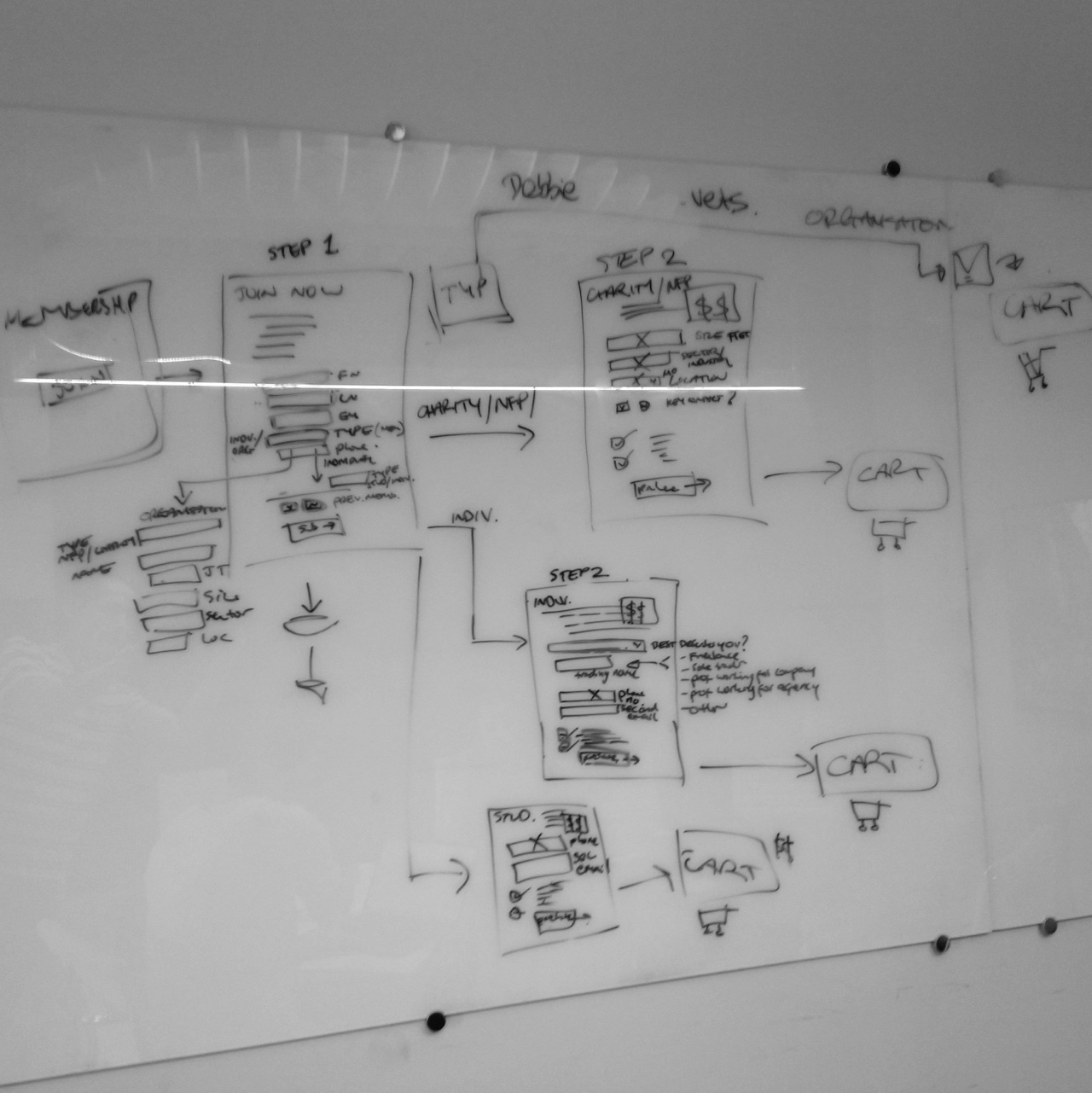
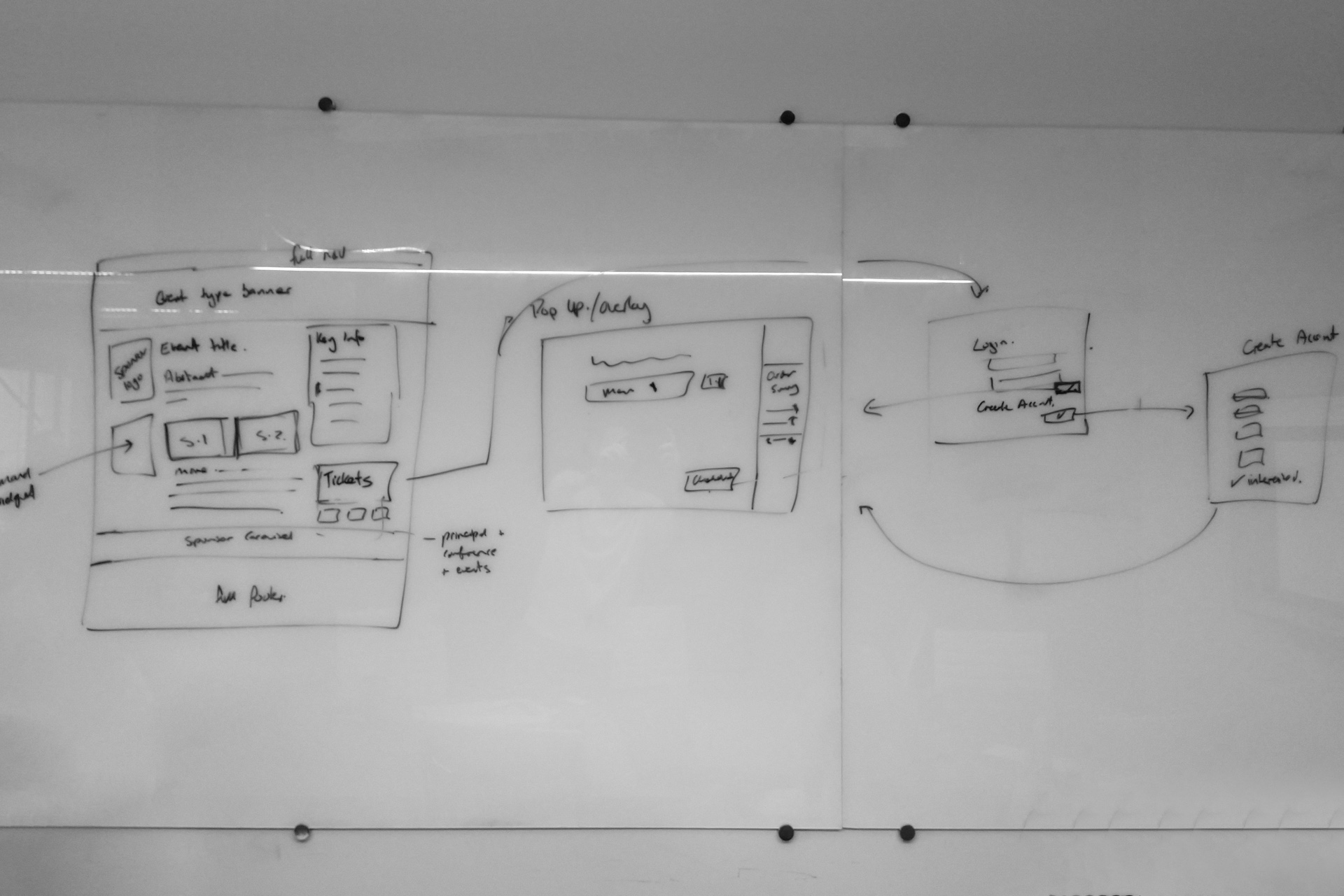
The solution was to conduct a thorough user journey mapping exercise over several weeks focusing on one key area at a time. From here low-fidelity wireframes were developed and again tweaked a number of times to match any new findings. Once the wireframes were completed, approved and tested on users, the design could begin.
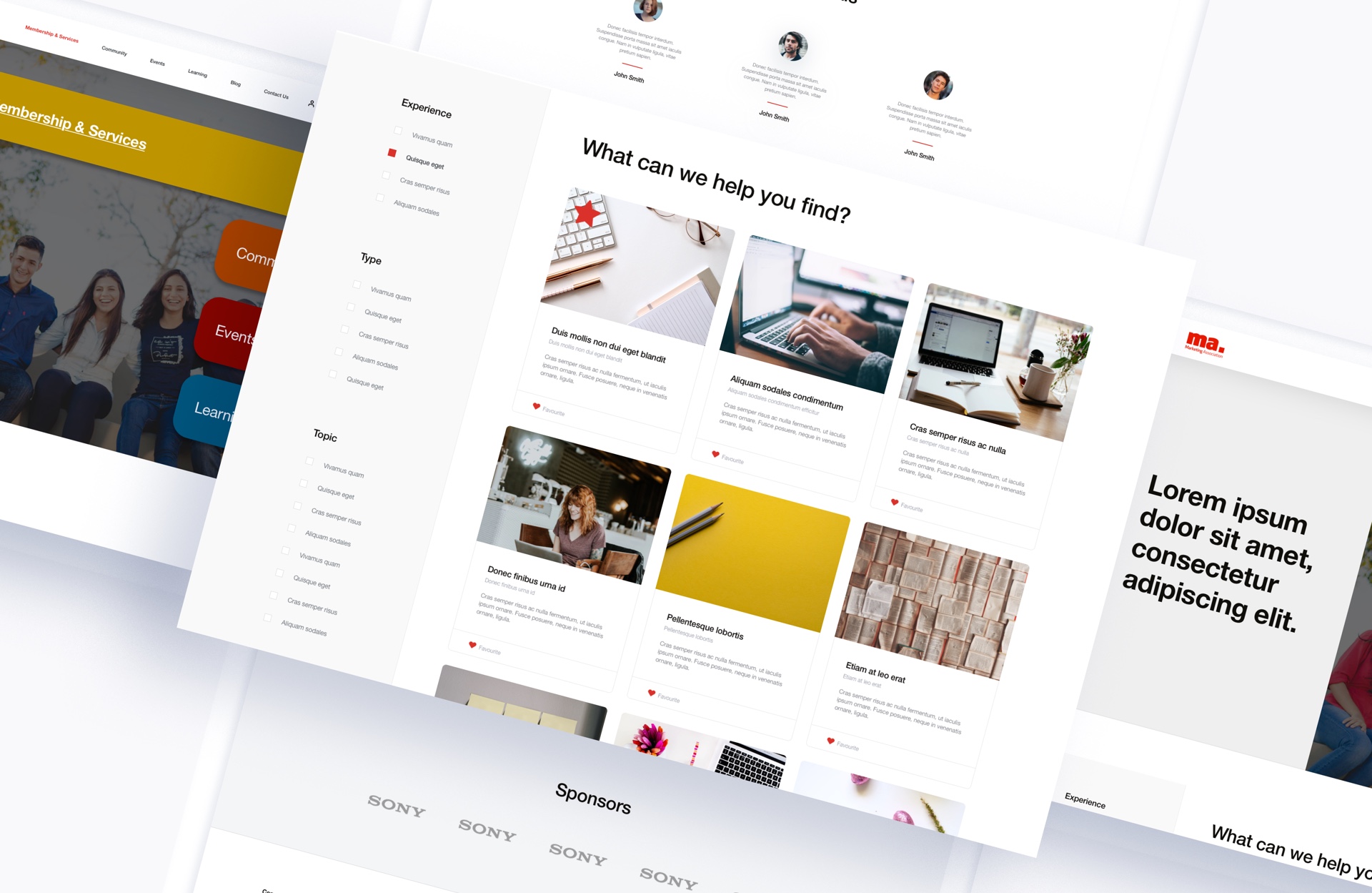
The key goals for design were to keep it in line with the current brand but at the same time developing a unique style that would make them stand out amongst their competitors. Bold typography, lots of white space and good use of colour were all at the forefront of all design considerations.


The result of this lengthy process was a clean, modern website that resonated with its users and allowed them to find exactly the content they needed in as little actions as possible. The 'clicks-to-find' content was reduced about 50%, and there was an increase in the length of time users were staying engaged on the website - along with some very positive feedback!
